Creating Your Dream Neutral Bathroom: A Timeless Sanctuary That Actually Works
Neutral bathroom design is honestly one of the smartest decisions I ever made for my home, and I’m gonna tell you exactly why it works so darn well.
Last year, my master bathroom looked like a confused rainbow threw up in there—teal accents that seemed like a good idea in 2019, those weird geometric tiles I thought were trendy, and don’t even get me started on the bronze fixtures mixed with chrome. It was a mess.
So I stripped everything back to basics and went full neutral, and wow, what a difference. My mornings feel calmer, the space looks bigger (it’s literally the same 8×10 space!), and here’s the kicker—I haven’t gotten tired of it like I did with every other “trendy” thing I’ve tried.
💡 Steal This Look
- Paint Color: Sherwin-Williams Alabaster SW 7008
- Furniture: floating walnut vanity with clean lines, freestanding soaking tub with matte white finish, backlit LED medicine cabinet
- Lighting: matte black sconces flanking the mirror, recessed can lights with warm dimmable LEDs
- Materials: large-format porcelain tile in warm greige, brushed brass fixtures, natural linen shower curtain, white oak shelving
I learned the hard way that ‘neutral’ doesn’t mean ‘boring’—it’s actually the opposite. When you strip away the visual noise, you start noticing the quality of materials and how light moves through the space, which feels quietly luxurious every single morning.
Why Neutral Bathrooms Just Hit Different
I’m not gonna lie to you with some fancy design theory. The real reason neutral bathrooms work is because they give your brain a break.
When you stumble in at 6 AM barely awake, you don’t need visual chaos. You need calm. You need clean. You need a space that feels like an actual sanctuary instead of a storage closet with a toilet.
Here’s what makes neutral bathrooms incredible:
- They make small bathrooms look way bigger than they actually are
- You can change your style without redoing everything
- They never look dated (I’m looking at you, 2010s chevron pattern)
- Cleaning is easier because you can actually see dirt and soap scum
- They increase your home’s resale value like crazy
My friend Sarah ignored my advice and went with dark purple walls. Looked great for three months. Now she hates it but doesn’t have the budget to redo everything. Don’t be like Sarah.
✎ Steal This Look
- Paint Color: Benjamin Moore Chantilly Lace OC-65
- Furniture: floating white vanity with clean lines, wall-mounted toilet for visual lightness, open wood shelving in natural oak
- Lighting: backlit LED mirror with dimmable function, recessed can lights in warm 2700K
- Materials: large-format porcelain tile in warm greige, brushed nickel fixtures, natural linen shower curtain, matte white ceramic accessories
I’ve lived through the regret of a ‘safe’ gray that turned my bathroom into a dentist’s office—now I always test three warm whites at different times of day before committing.
Getting Started: The Foundation That Makes or Breaks Everything
Time You’ll Need: 4-8 weeks for a complete transformation (I did mine in 6 weeks working weekends)
What It’ll Cost You: Anywhere from $2,000 if you’re budget-conscious to $15,000+ if you’re going full luxury (mine was around $7,500 including my mistakes)
DIY or Pro? Depends on what you’re doing—painting is totally doable yourself, but tile work and plumbing? Yeah, call someone unless you really know what you’re doing.
Your Core Color Palette (This Is Where Most People Mess Up)
I tested literally 23 different paint samples before choosing my final colors. Sounds excessive, right? But here’s the thing—neutrals look completely different depending on your lighting, and what looks like a soft beige in the store can turn straight-up pink in your bathroom.
The neutrals that actually work:
- Whites: Crisp, clean, makes everything look fresh (I used this for my trim)
- Creams: Warmer than white, super cozy without being yellowy
- Soft beiges: My wall color—looks amazing with natural light
- Warm grays: Perfect for accent areas, adds depth without darkness
- Cool grays: Great if your bathroom gets tons of natural light
Pro tip: Paint your samples directly on the bathroom wall and look at them morning, noon, and night for at least three days.
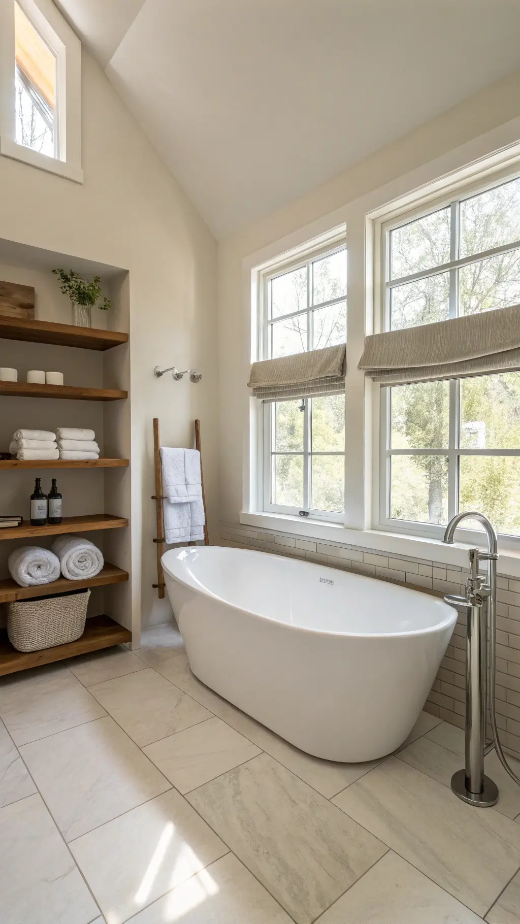
💡 Steal This Look
- Paint Color: Farrow & Ball Ammonite 274
- Furniture: floating walnut vanity with integrated storage, backlit LED medicine cabinet, freestanding soaking tub on matte black feet
- Lighting: flush-mount LED ceiling fixture with high CRI (90+) for accurate color rendering, paired with wall sconces at eye level on either side of mirror
- Materials: large-format porcelain tile with rectified edges, honed marble or quartzite countertops, brushed brass fixtures, natural linen shower curtain or frameless glass, woven seagrass baskets
I learned this the hard way when my ‘perfect’ greige turned green-gray under my LED vanity lights—now I always live with samples for a full week before deciding.
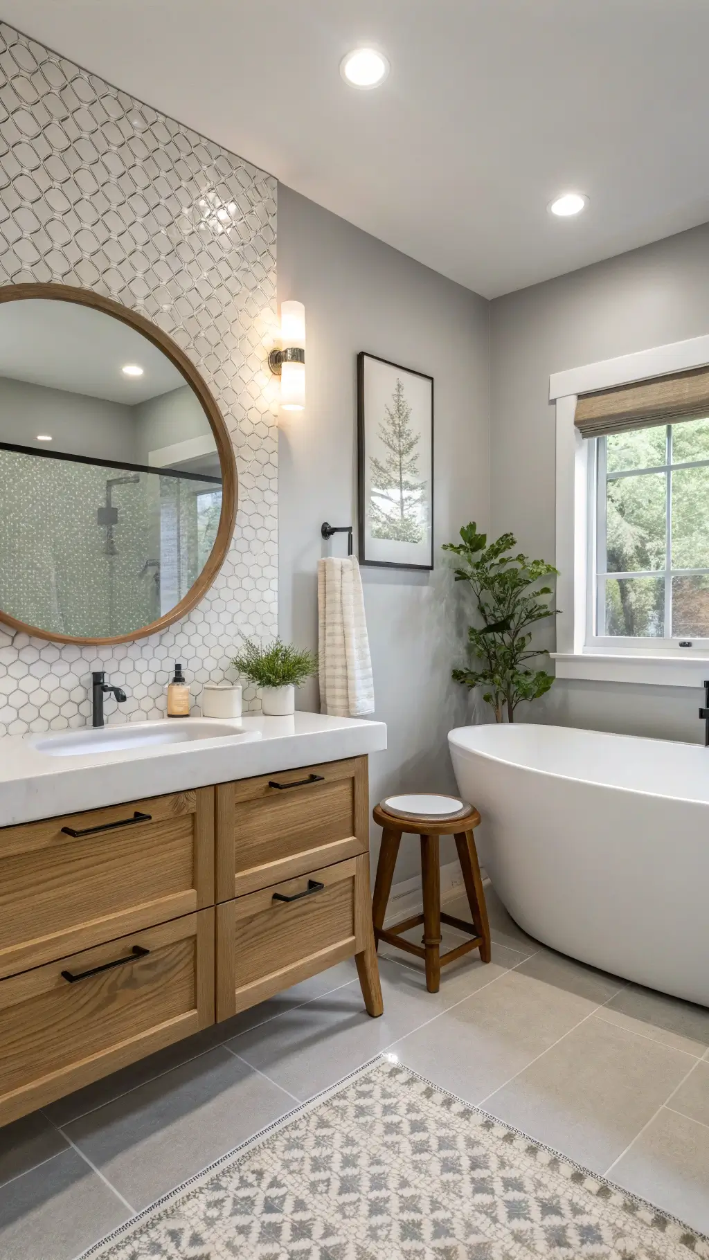
The Must-Have Pieces That Actually Matter
Your Hero Piece: The Focal Point
Every great neutral bathroom needs one statement piece that draws your eye.
For me, it was a freestanding bathtub in glossy white. Cost more than I wanted to spend, but it completely transformed the space. Every single person who visits comments on it.
If you don’t have space for a tub (or the budget), your vanity becomes your hero piece. I’m talking quality here—solid wood vanity cabinets with either shaker-style doors or recessed panels.
Vanity options that work:
- Pure white for maximum brightness and modern feel
- Medium-tone wood for warmth (especially good if your walls are cool-toned)
- Soft gray if you’re going full monochromatic
Fixtures That Don’t Suck
I used to think all faucets were basically the same. Then I installed a quality brushed nickel faucet and realized what I’d been missing.
Metal finishes that look expensive without being trendy:
- Brushed nickel: My personal choice, hides water spots like a champ
- Chrome: Classic and shiny, but shows every fingerprint
- Unlacquered brass: Gets better with age, develops a natural patina
Whatever you pick, use the same finish throughout the entire bathroom.
![]()
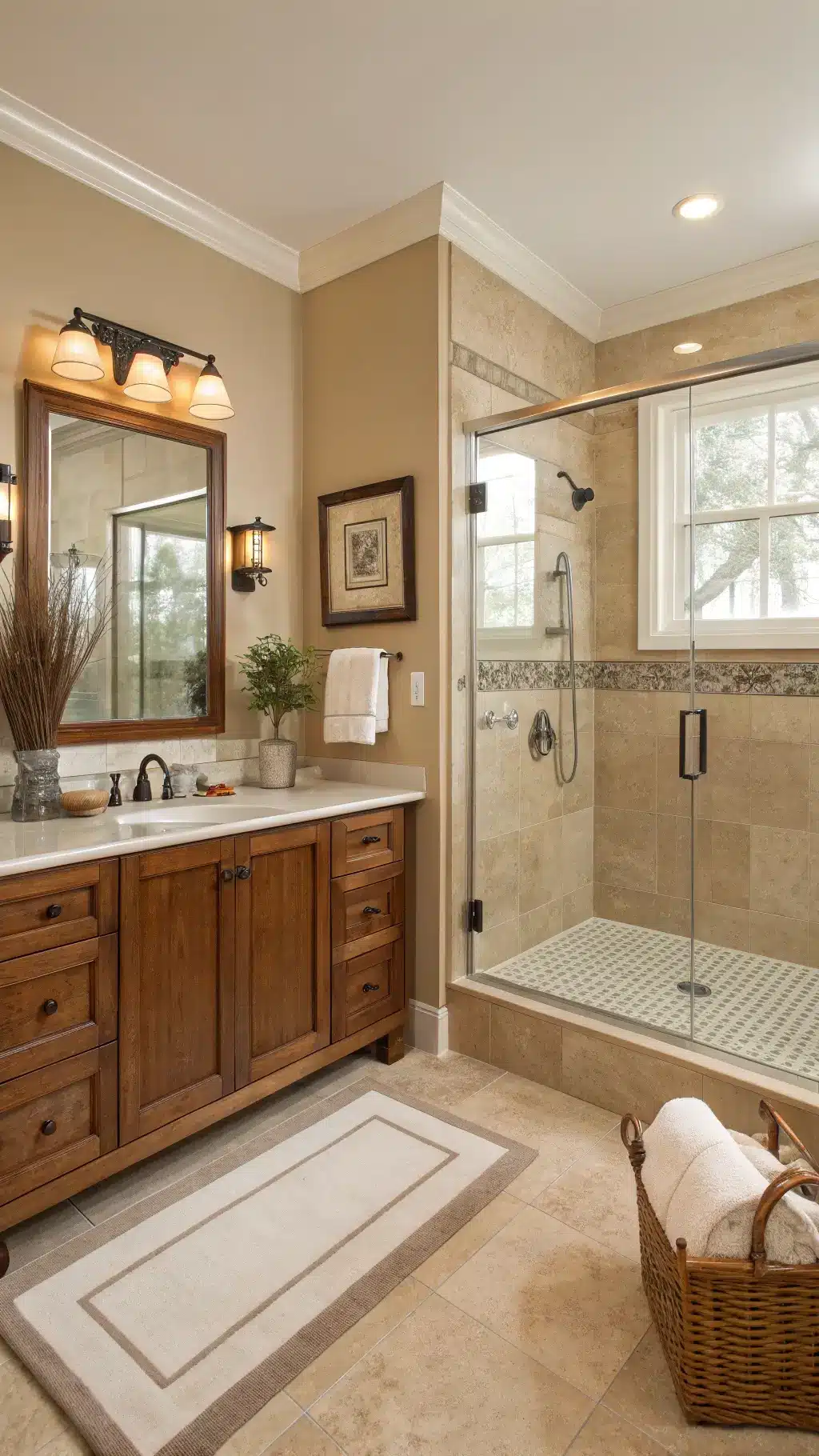
The Shower Situation
Frameless glass shower doors were honestly the best investment in my whole remodel. They make the bathroom feel twice as big because you can see straight through.
✎ Steal This Look
- Paint Color: Behr Polar Bear 75
- Furniture: freestanding glossy white soaking tub or solid wood shaker-style vanity cabinet in pure white, medium-tone oak, or soft gray with recessed panel doors
- Lighting: polished chrome or brushed nickel vanity sconces flanking the mirror
- Materials: high-gloss porcelain, solid wood cabinetry, brushed metal fixtures, natural stone or quartz countertop
I learned this the hard way after installing a basic box-store vanity that looked fine in photos but felt hollow every time I opened a drawer—upgrading to solid wood changed how the whole room felt to actually live in.
Styling Magic: Where Texture Saves Everything
Here’s what I learned: An all-neutral bathroom can look boring and flat if you don’t layer textures. This is the secret sauce that separates “hospital waiting room” from “luxury spa.”
Texture combinations that work amazing together:
- Smooth ceramic subway tiles on walls + rough natural stone on floors
- Matte paint + glossy tile
- Smooth quartz countertops + textured woven storage baskets
- Flat wall surfaces + dimensional mosaic tile accents