Transform your kitchen into a stunning masterpiece with the perfect cabinet color that speaks to your soul! Whether you’re dreaming of a sun-drenched yellow that makes morning coffee feel like pure sunshine, or craving the sophisticated drama of deep indigo that turns every meal into an elegant affair, the right cabinet color has the power to completely revolutionize your space. Get ready to fall in love with your kitchen all over again as we explore 27 incredible cabinet colors that range from timeless classics to bold showstoppers – each one guaranteed to spark joy and inspire your next home transformation. Your dream kitchen is just a color choice away, and we’re here to help you find the perfect shade that makes your heart skip a beat every time you walk through the door!
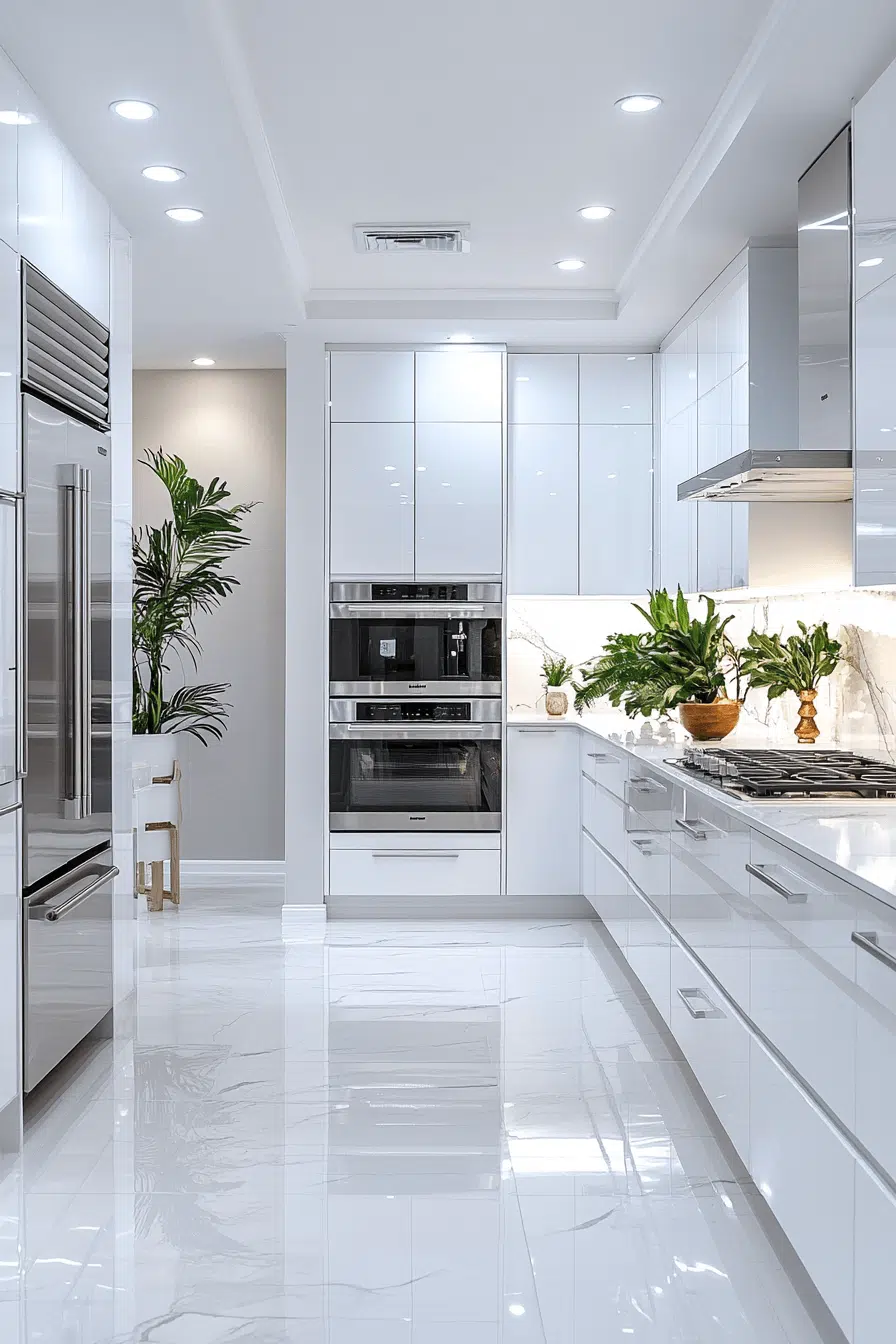
1. Timeless White Brightness
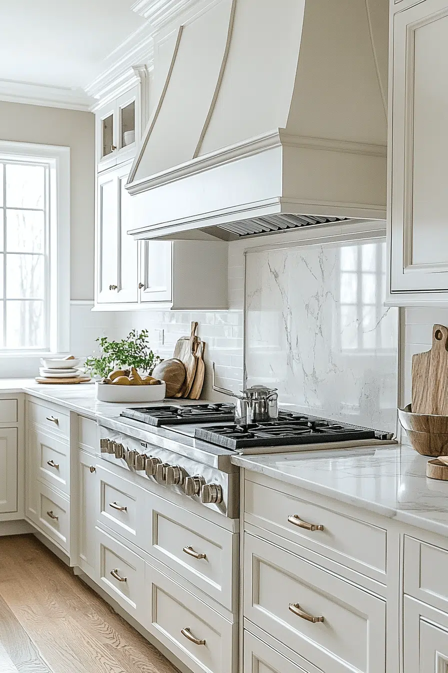
Timeless appeal shines through when white cabinets anchor your kitchen cabinet color ideas. The bright, reflective finish instantly opens up the room and enhances natural light. This versatile shade blends seamlessly with everything from modern to farmhouse styles. White cabinetry also makes it easy to refresh your look with new accents over time. The result feels clean, flexible, and always on trend.
💡 Steal This Look
- Paint Color: Sherwin-Williams Alabaster SW 7008
- Furniture: Light wood or white kitchen islands with open shelving; white or natural wood bar stools with turned legs for farmhouse compatibility
- Lighting: Chrome or brushed nickel pendant lights with clear glass shades to maximize brightness and complement white cabinetry
- Materials: Polished quartz or white subway tile backsplash; stainless steel hardware and appliances; light wood countertops or white marble
White kitchens are the ultimate blank canvas—they’re not boring, they’re *intentional*. This timeless choice gives you the freedom to layer in personality through hardware, lighting, and accents without fear of clashing.
2. Black Bold Statement
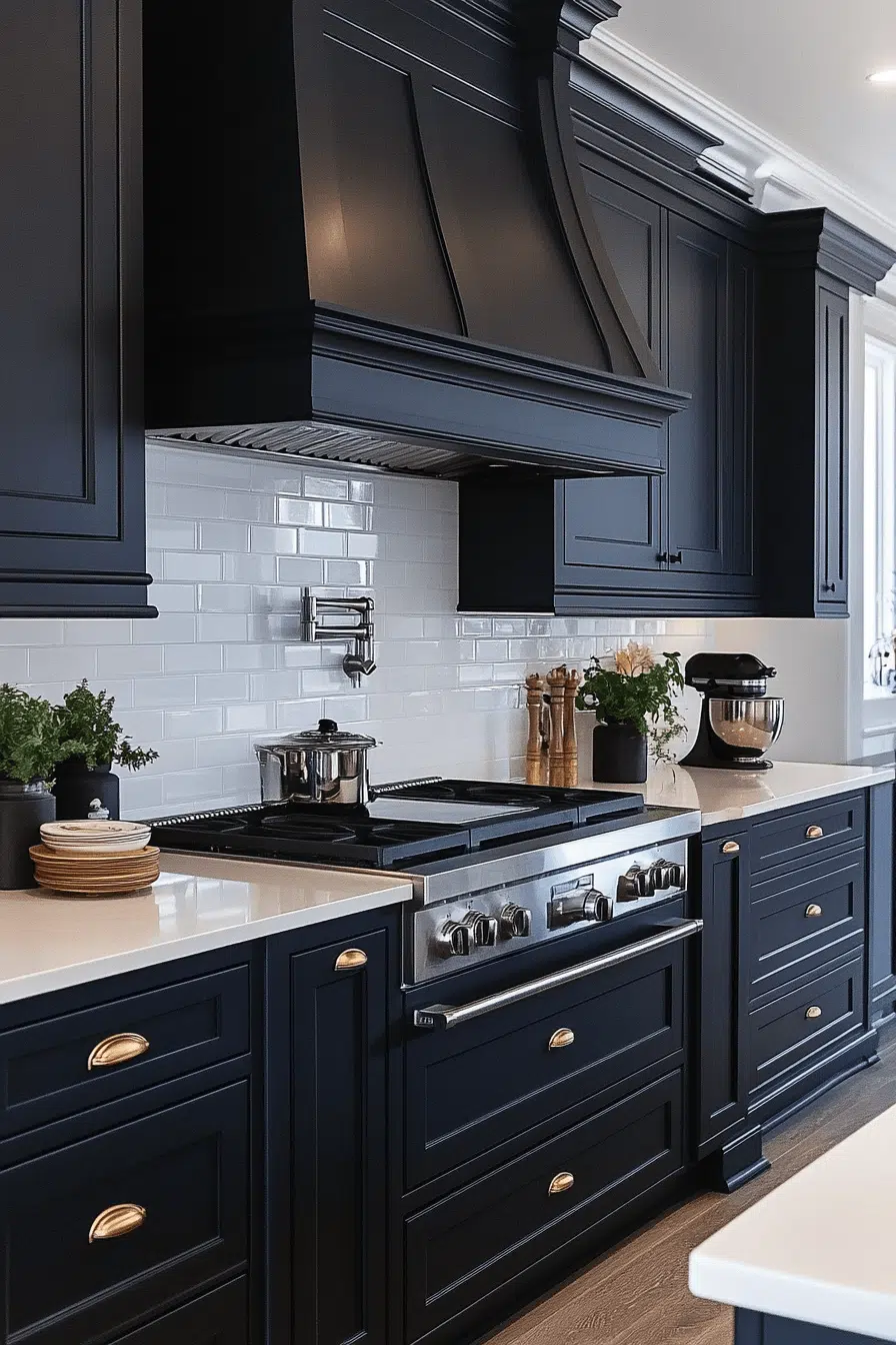
Bold sophistication takes over when deep black cabinetry leads your kitchen cabinet color ideas. This dramatic shade creates striking contrast with light surfaces and metallic accents. Black cabinets also help disguise everyday wear for a polished look. Whether matte or glossy, the finish adds modern edge and elegance. The space feels confident and high-impact.
✎ Steal This Look
- Paint Color: Benjamin Moore Cavern Black HC-189
- Furniture: Sleek black kitchen island with waterfall edge or black metal bar stools with upholstered seats
- Lighting: Pendant lights with brushed gold or chrome fixtures paired with warm white bulbs to soften the black
- Materials: Matte or glossy black cabinet lacquer, white marble or light quartz countertops, metallic hardware in brass or chrome
Black kitchens are having a moment because they’re bold without being trendy. This is the statement color for homeowners who want their kitchen to feel like an intentional design choice, not a safe default.
3. Sunny Yellow Glow
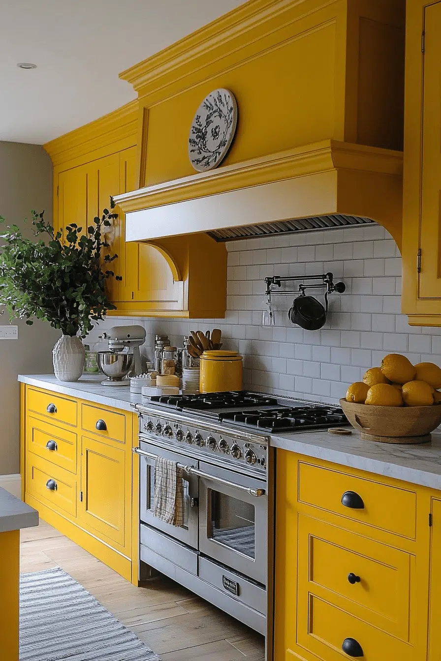
Bright energy enters the room when yellow becomes part of your kitchen cabinet color ideas. This sunny hue instantly lifts the mood and adds cheerful personality. Yellow cabinetry pairs beautifully with soft neutrals for balance. The warmth makes kitchens feel welcoming and lively. It’s a playful choice that never feels boring.
💡 Steal This Look
- Paint Color: Farrow & Ball Sudbury Yellow 51
- Furniture: Light oak or natural wood kitchen island with open shelving; cream or soft white base cabinets to balance the yellow upper cabinetry
- Lighting: Warm brass or gold pendant lights above the island; under-cabinet warm white LED strips to enhance the cheerful glow
- Materials: Matte or satin-finish cabinet paint; light marble or butcher block countertops; natural wood flooring or light tile
Yellow kitchens radiate optimism and warmth, especially in homes that catch morning light. This cheerful choice transforms the kitchen into the heart of the home—a space where family naturally gathers.
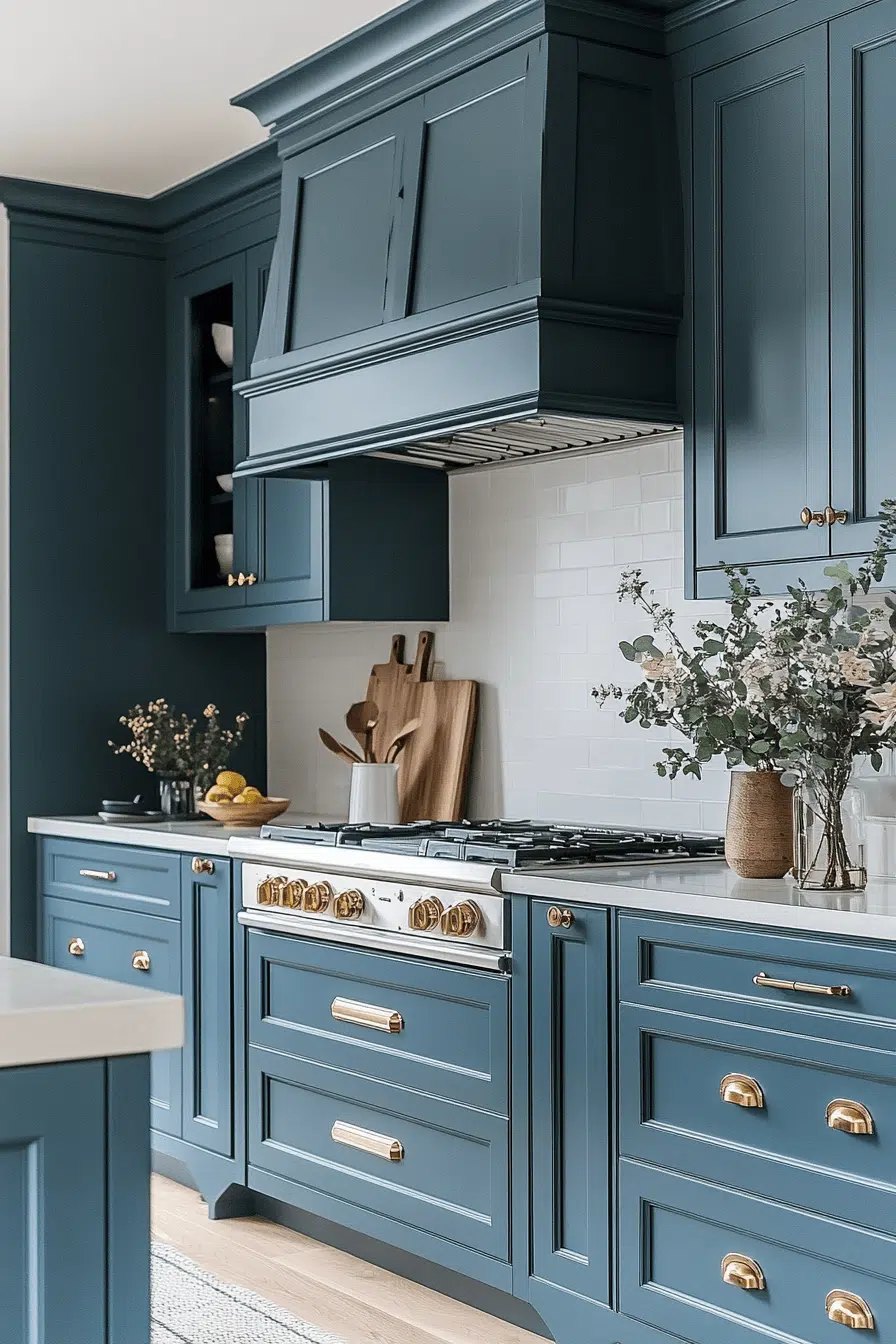
4. Coastal Blue Calm
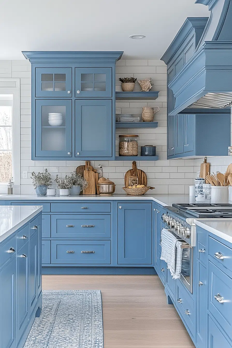
Coastal calm flows in when blue tones inspire your kitchen cabinet color ideas. Soft ocean shades bring a relaxed, breezy feeling into the heart of your home. Lighter blues feel airy while deeper tones add refined drama. The color pairs beautifully with white, sand tones, and brushed metals. The result feels peaceful and refreshing.
★ Steal This Look
- Paint Color: Behr Breath of Fresh Air PPU13-11
- Furniture: Light wood or whitewashed kitchen island with open shelving; natural wood bar stools with woven seating
- Lighting: Brushed metal pendant lights with frosted glass shades; under-cabinet LED strip lighting in warm white
- Materials: Soft-close cabinet hinges in brushed nickel, white subway tile backsplash, light oak or whitewashed wood accents, matte hardware
Coastal blue kitchens feel like a permanent retreat to the seaside, grounding your home in tranquility. This palette works especially well in kitchens with natural light, where soft blues seem to shift and breathe throughout the day.
5. Forest Green Depth
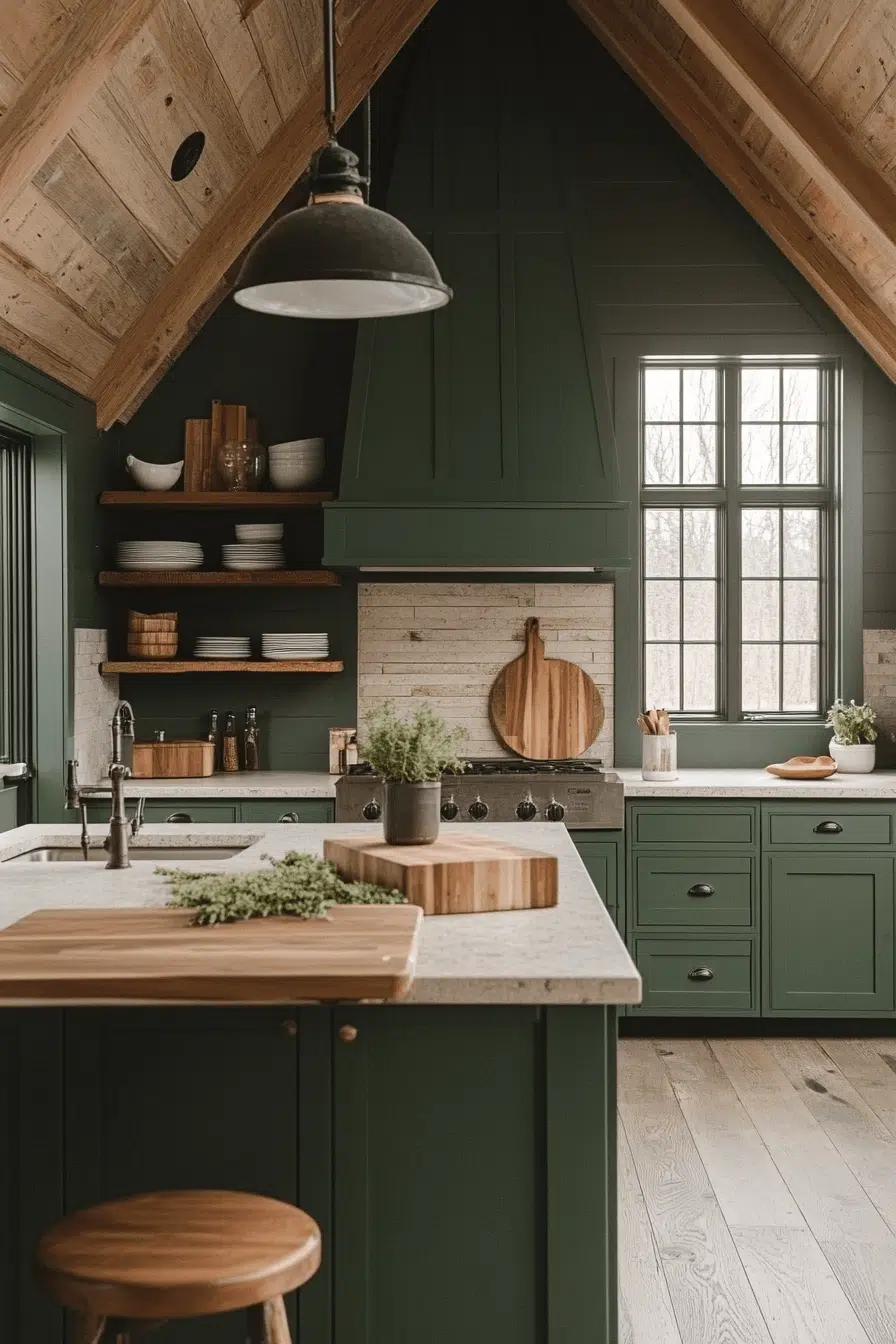
Natural richness takes center stage when forest green guides your kitchen cabinet color ideas. This deep green creates a grounded, cozy atmosphere with elegant depth. It complements wood finishes and warm metallic hardware beautifully. Green cabinetry brings the outdoors inside with timeless charm. The look feels calming yet full of personality.
🖼 Steal This Look
- Paint Color: Valspar Forest Green 508B-7
- Furniture: Natural wood kitchen island with warm honey or walnut finish; open shelving with reclaimed wood accent; bar stools with leather or natural linen upholstery in cream or warm taupe
- Lighting: Warm brass or warm copper pendant lights with frosted or amber glass; under-cabinet warm LED strip lighting (2700K) to enhance wood tones
- Materials: Matte or soft-sheen cabinet finish; natural wood countertops or warm wood-look quartz; brushed brass or warm bronze cabinet hardware; white subway tile or natural stone backsplash
Forest green kitchens feel like a sanctuary—they ground a space with the calming presence of nature while maintaining sophistication. This is the color choice for homeowners who want their kitchen to feel like a warm refuge, not just a functional workspace.
6. Soft Gray Elegance
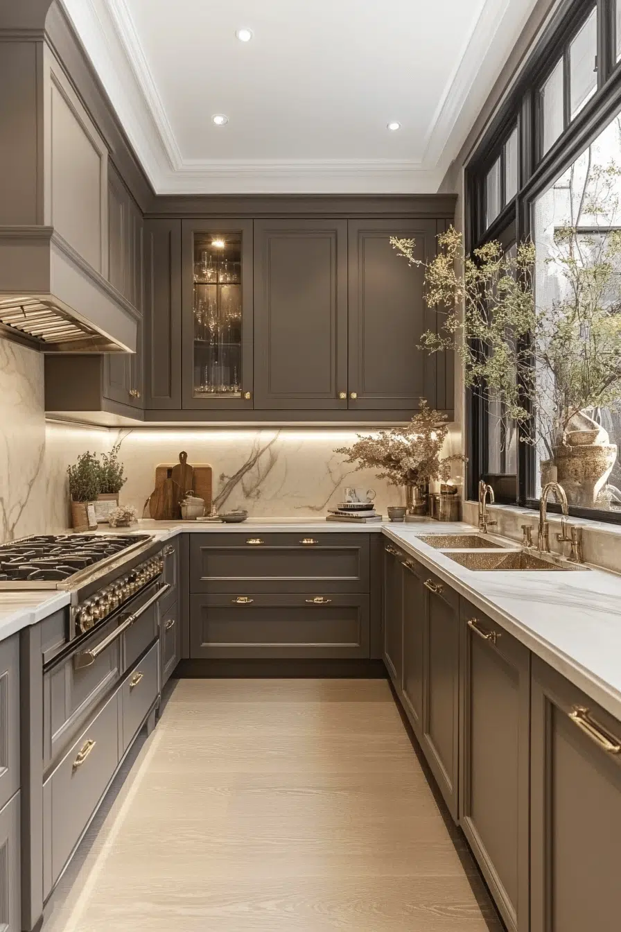
Subtle sophistication defines this soft gray approach to kitchen cabinet color ideas. Gray offers flexibility while maintaining a polished and modern appearance. It works effortlessly with bold accents or muted palettes. The color adds depth without overpowering the room. The result feels calm, balanced, and refined.
✎ Steal This Look
- Paint Color: PPG Accessible Beige PPG1012-2 – a soft, warm gray-beige that provides subtle sophistication without cold undertones, perfect for complementing soft gray cabinetry
- Furniture: Stainless steel bar stools with soft gray upholstered seats; natural wood or white oak dining table to anchor the space with warmth against gray cabinetry
- Lighting: Brushed nickel or matte black pendant lights with warm white bulbs (2700K) to soften the gray palette and add refinement over the island or sink
- Materials: Soft gray lacquered or matte cabinet finishes; white subway tile or light marble backsplash; brushed metal hardware in nickel or chrome for a polished, modern edge
Soft gray is the grown-up choice for homeowners who want modern polish without drama. It’s a canvas that whispers elegance rather than demands attention, making it perfect for kitchens that need to feel both current and timeless.
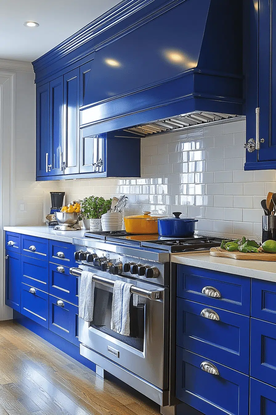
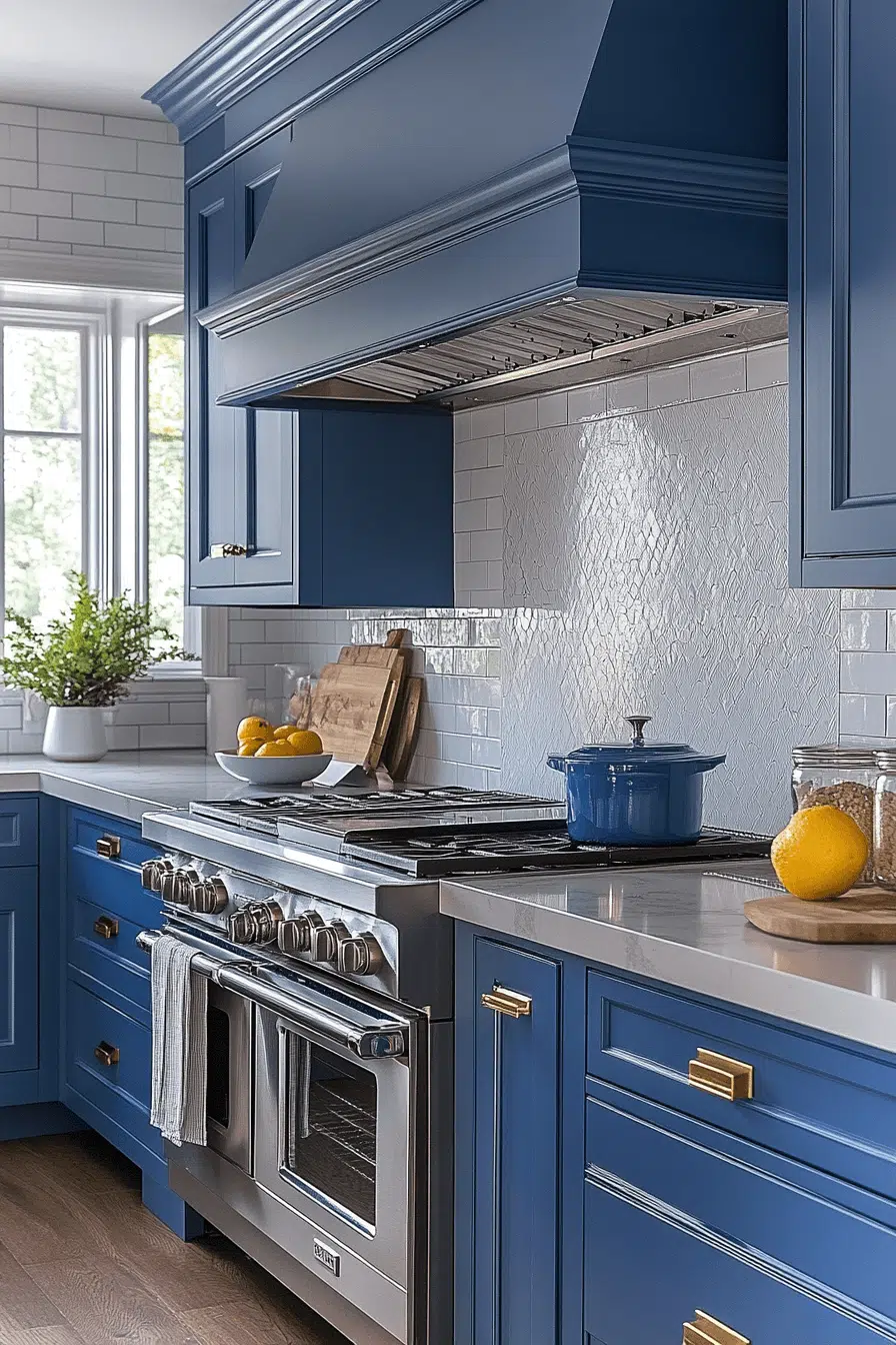
7. Navy Classic Luxe
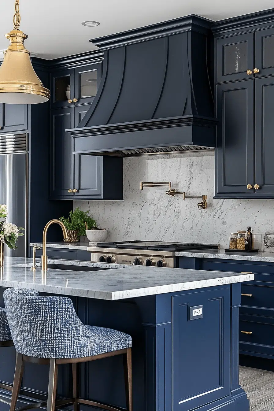
Classic luxury shines when navy becomes part of your kitchen cabinet color ideas. This rich blue adds depth while staying timeless and elegant. Navy pairs beautifully with gold, brass, and crisp white accents. The result feels grounded yet dramatic. It’s bold without feeling overwhelming.
🏠 Steal This Look
- Paint Color: Dunn-Edwards Deep Ocean DE 5783
- Furniture: Kitchen island with navy cabinetry, brass hardware pulls, white marble or quartz countertops, and open shelving with gold-trimmed glassware display
- Lighting: Brass pendant lights with frosted or clear glass shades hung above island or sink area
- Materials: High-gloss or satin-finish navy cabinet paint, polished brass fixtures, white subway tile or marble backsplash, brushed gold hardware
Navy kitchens feel inherently sophisticated without trying too hard. This color says you have refined taste while keeping the space functional and timeless—perfect for anyone who wants drama with restraint.
8. Terracotta Warmth
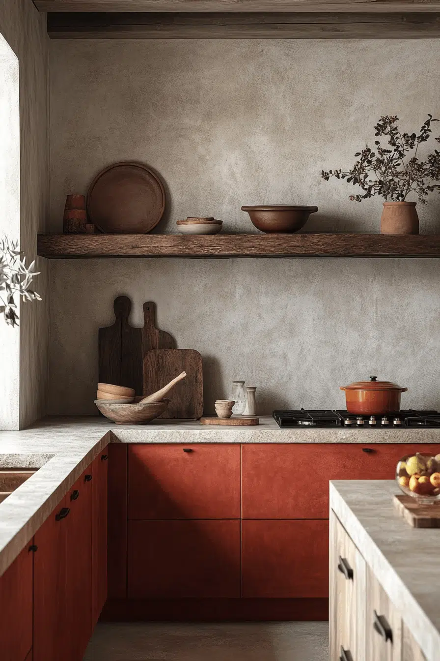
Warm Mediterranean vibes come alive with terracotta in your kitchen cabinet color ideas. This earthy tone brings handcrafted charm and inviting warmth. It pairs naturally with stone, wood, and textured finishes. The space feels sun-kissed and cozy. The look is rustic yet stylish.
🎨 Steal This Look
- Paint Color: Clare Paint Terracotta CC1290
- Furniture: Open wooden shelving with natural wood grain, rustic kitchen island with distressed wood base and terracotta-toned countertop
- Lighting: Wrought iron or bronze pendant lights with warm amber glass, or rustic chandelier with Edison bulbs
- Materials: Natural stone backsplash, weathered wood cabinetry, textured terracotta tile or stucco finishes, aged brass hardware
Terracotta kitchens capture that sun-soaked, languid European feeling—perfect if you love spaces that feel lived-in and welcoming rather than sterile. This warm earthy tone ages beautifully and only gets more characterful over time.
9. Mint Fresh Energy
Fresh charm fills the room when mint becomes part of your kitchen cabinet color ideas. This soft green shade brightens small spaces and adds playful personality. Mint keeps kitchens feeling airy and light. It pairs beautifully with brass, wood, and creamy whites. The overall effect feels crisp and cheerful.
★ Steal This Look
- Paint Color: Fine Paints of Europe Farrow & Ball No. 80 Mizzle (soft sage-mint) CODE FB80
- Furniture: Light oak or natural wood kitchen island with open shelving; cream or off-white countertops; brass hardware on cabinet doors
- Lighting: Brass pendant lights with frosted glass or opal shades; under-cabinet LED strip lighting in warm white
- Materials: Mint cabinet fronts (lacquered or matte finish); brushed brass hardware; white subway tile or light wood backsplash; natural wood accents
Mint cabinets deliver that effortless, sun-soaked cottage kitchen feeling without requiring a full renovation. It’s the perfect choice if you want personality and freshness without the commitment of bold jewel tones.
10. Burgundy Bold Beauty
Rich drama unfolds when burgundy inspires your kitchen cabinet color ideas. This deep wine tone adds warmth and bold sophistication. Burgundy looks stunning with marble, wood, and gold finishes. The space feels moody yet welcoming. It’s a powerful way to make a statement.
🎨 Steal This Look
- Paint Color: Sherwin-Williams SW 2803 Rookwood Dark Green or Benjamin Moore HC-181 Caliente for burgundy-adjacent depth on accent walls; pair with Benjamin Moore OC-17 White Dove for surrounding walls to let cabinets command the space
- Furniture: Kitchen island with warm wood base and marble or quartz countertop; wooden bar stools with burgundy upholstered seats; open shelving in natural wood tones
- Lighting: Pendant lights with brass or gold hardware and warm Edison bulbs; under-cabinet warm LED strips to highlight marble backsplash
- Materials: Burgundy lacquered or matte cabinet finish, Carrara or Calacatta marble countertops and backsplash, brass hardware and fixtures, warm wood accents in island or open shelving
Burgundy kitchens are for homeowners ready to commit to bold elegance. This isn’t a trend color—it’s a timeless statement that says you understand the power of color and aren’t afraid to live with intention.
11. Beige Cozy Neutral
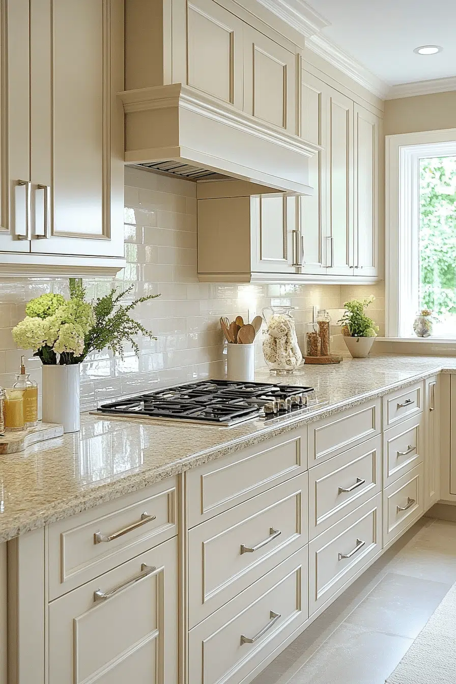
Soft warmth defines this beige approach to kitchen cabinet color ideas. Creamy neutral tones create a welcoming and versatile backdrop. Beige works beautifully with nearly every color palette. The result feels serene and timeless. It’s a safe choice with lasting appeal.
✎ Steal This Look
- Paint Color: Sherwin-Williams Accessible Beige SW 7036
- Furniture: Light oak or natural wood kitchen island with open shelving; cream-colored bar stools with warm wood legs
- Lighting: Warm brass or brushed gold pendant lights above island; under-cabinet warm LED strips for task lighting
- Materials: Matte or satin-finish cabinet doors; natural wood countertops or cream marble; soft linen or jute accents
Beige kitchens are the ultimate blank canvas—they whisper rather than shout, making them perfect if you love flexibility and timeless design. This is the safe bet that never feels boring when layered thoughtfully.
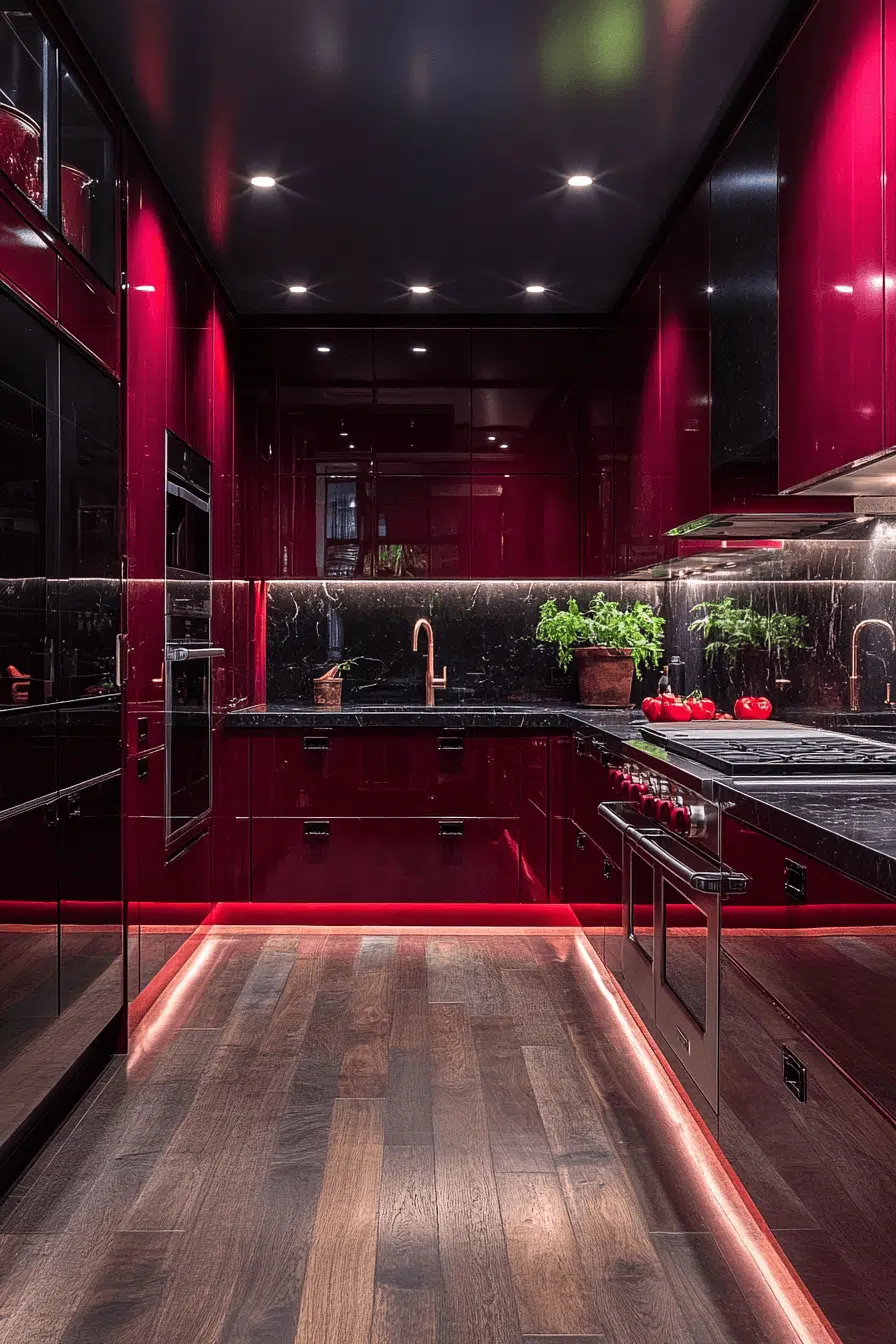
12. Red Statement Power
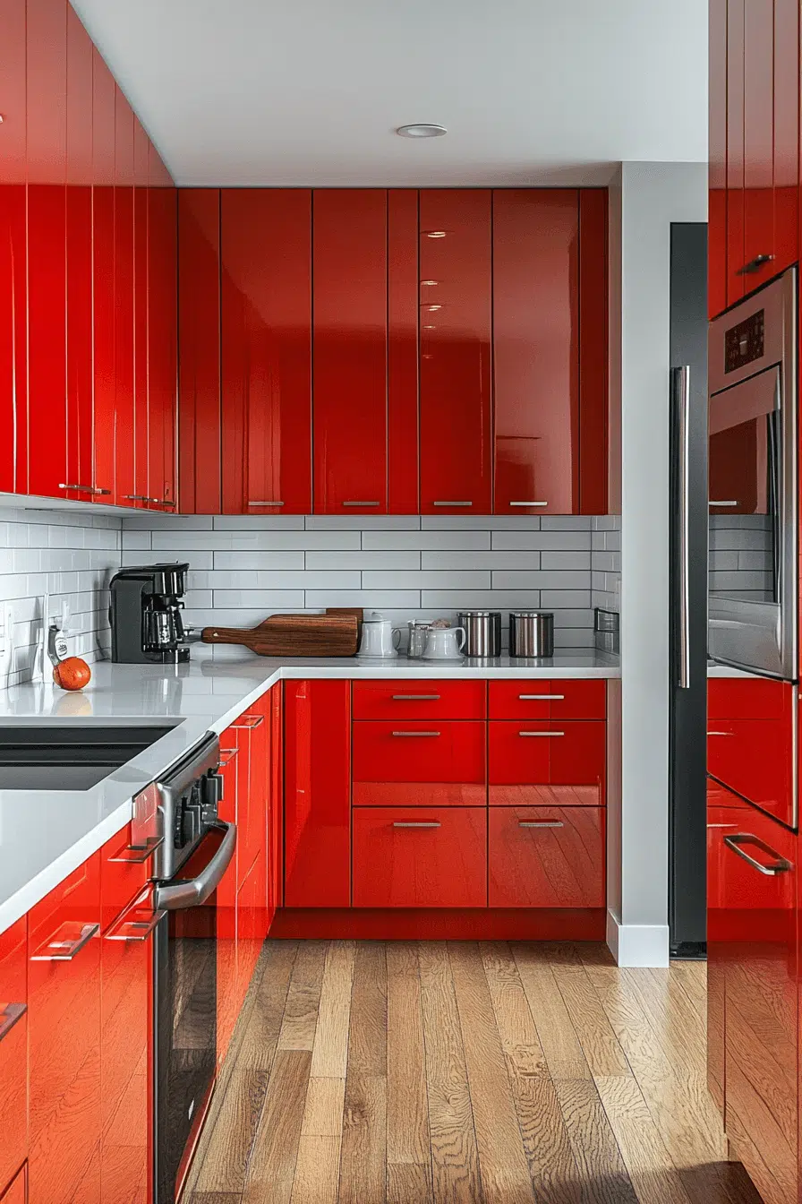
High-energy personality bursts through when red influences your kitchen cabinet color ideas. This vibrant shade adds excitement and bold character. Red cabinetry brings life to modern, retro, and eclectic kitchens alike. Balanced with neutrals, it feels stylish instead of overwhelming. The look is daring and unforgettable.
🖼 Steal This Look
- Paint Color: Benjamin Moore Red Delicious HC-189
- Furniture: Stainless steel bar stools with black metal frames; light wood or white kitchen island with clean lines
- Lighting: Industrial pendant lights with matte black or brushed nickel fixtures
- Materials: Polished concrete countertops, white subway tile backsplash, matte hardware in black or brushed brass
Red kitchens signal confidence and energy. This isn’t timid design—it’s for homeowners ready to make a style declaration and live boldly in their everyday space.
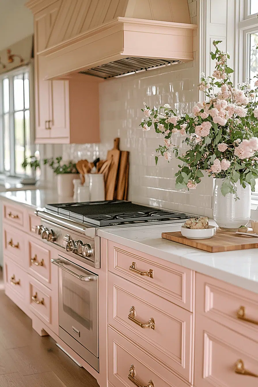
13. Blush Soft Chic
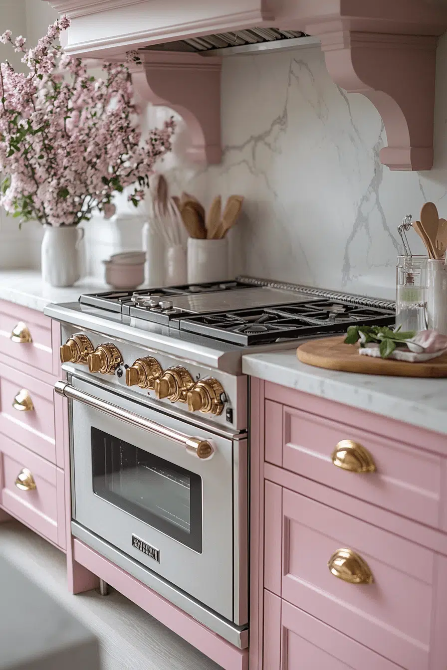
Soft romance enters the space when blush tones shape your kitchen cabinet color ideas. Pale pink adds warmth without overpowering the room. It pairs beautifully with cool grays and brass accents. The look feels modern, chic, and calming. It’s a subtle way to be bold.
💡 Steal This Look
- Paint Color: Farrow & Ball Calluna 328
- Furniture: Light oak or natural wood kitchen island with clean-lined base; soft gray upholstered bar stools with brass nailhead trim
- Lighting: Brass pendant lights with frosted glass diffusers over island; under-cabinet warm white LED strips
- Materials: Soft blush cabinet fronts (matte or satin finish), cool gray subway tile backsplash, brass hardware and fixtures, light marble or light gray quartz countertop
Blush soft chic proves that pink kitchens are grown-up and timeless when executed with restraint. This palette whispers rather than shouts, making it perfect for those who want subtle personality without trendy risk.
14. Espresso Rich Depth
Deep warmth defines this espresso-inspired take on kitchen cabinet color ideas. Dark brown tones bring richness and timeless depth. Espresso cabinetry pairs beautifully with light counters and metallic finishes. The look feels grounded and elegant. It also helps disguise everyday wear.
🌟 Steal This Look
- Paint Color: Behr Espresso Brown PPU5-2
- Furniture: Kitchen island with light marble or quartz countertop, open shelving with bronze or brass hardware accents
- Lighting: Brushed brass or bronze pendant lights suspended over island, recessed can lighting for task areas
- Materials: Dark stained wood cabinetry, light marble or granite countertops, metallic hardware (bronze, brass, or gunmetal), stainless steel appliances
Espresso kitchens deliver that timeless, high-end feel that never dates while practically hiding fingerprints and spills—perfect for real life. The warmth of brown prevents the coldness of all-white kitchens while maintaining elegance.
15. Cobalt Color Pop
Electric energy shines when cobalt becomes part of your kitchen cabinet color ideas. This vivid blue transforms cabinetry into a bold focal point. Cobalt pairs beautifully with soft neutrals and warm woods. The result feels modern and creative. It’s perfect for confident design lovers.
★ Steal This Look
- Paint Color: Valspar Nautical Navy 2107-10
- Furniture: Natural wood open shelving or light oak floating shelves to balance cobalt cabinetry; warm wood bar stools with natural finishes
- Lighting: Brushed gold or brass pendant lights with frosted glass or linen shades to soften cobalt intensity
- Materials: Soft cream or warm white countertops (quartz or marble), natural wood accents, matte finish hardware in warm bronze
Cobalt is for homeowners ready to make a statement—it’s bold without being trendy, and it photographs beautifully. This is the choice for designers who love color confidence and aren’t afraid of commitment.
16. Lavender Soft Calm
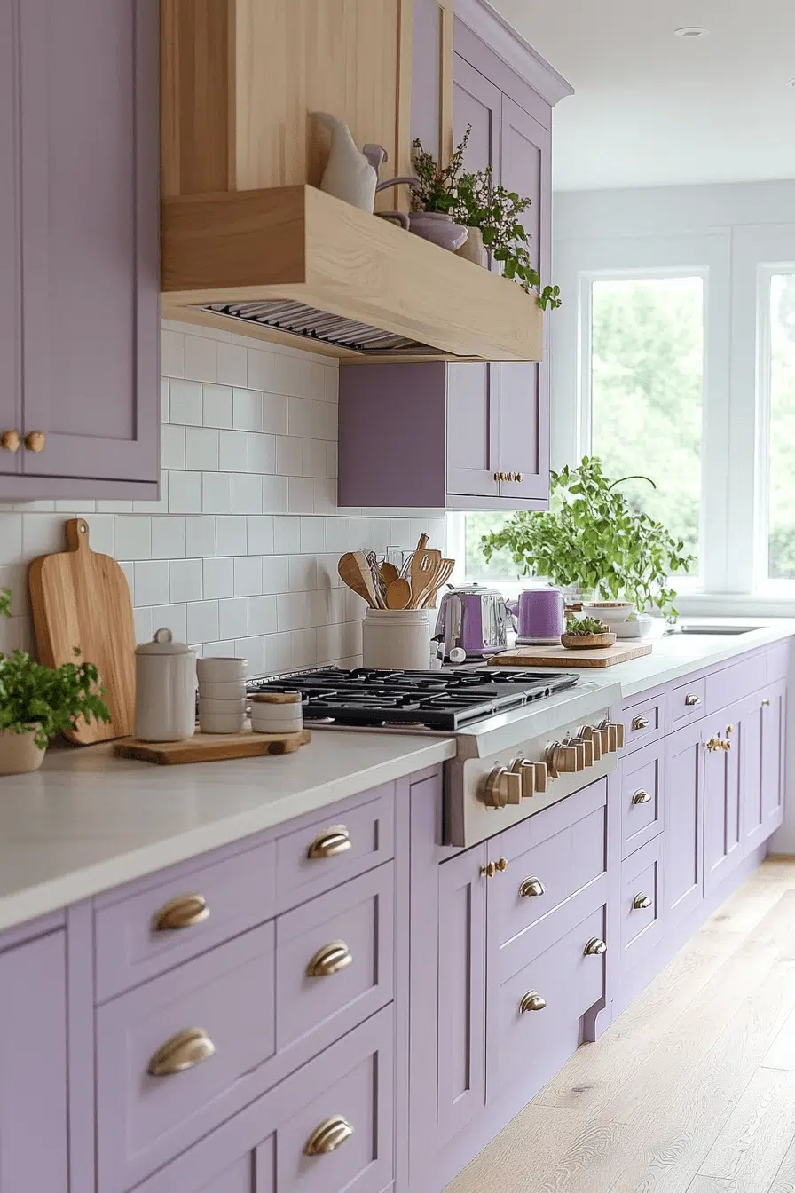
Soft creativity blooms when lavender enters your kitchen cabinet color ideas. This pastel hue adds calm with a playful twist. Lavender works beautifully with marble, light wood, and silver accents. The effect feels gentle yet refreshing. It’s perfect for serene, creative kitchens.
✎ Steal This Look
- Paint Color: PPG ColorName SOFTLAVENDER 2071-60
- Furniture: Light natural wood kitchen island with soft white countertop; open shelving in whitewashed wood for displaying ceramic pieces and glassware
- Lighting: Brushed silver pendant lights with frosted glass shades; warm white LED bulbs (2700K) to soften the lavender
- Materials: Marble countertops with soft gray veining; silver hardware on cabinet doors; light wood cabinetry; white subway tile backsplash
Lavender kitchens feel unexpectedly sophisticated—this isn’t a childish color choice, but rather a creative declaration that your space is designed for calm and inspiration. It’s perfect for homes where the cook is also the artist, dreamer, or someone who values serenity in their daily rituals.
17. Peach Sunny Warmth
Sunlit warmth glows through peach-toned kitchen cabinet color ideas. This cheerful shade brings softness and inviting energy. Peach pairs beautifully with cream, sage, and warm wood. The result feels bright and friendly. It’s ideal for joyful, relaxed kitchens.
🌟 Steal This Look
- Paint Color: Dunn-Edwards Peachy Keen DE5184
- Furniture: Warm wood cabinetry with soft peach finish, cream-colored kitchen island with butcher block or light wood countertop, open shelving in warm natural wood
- Lighting: Warm brass or gold pendant lights with frosted glass shades over kitchen island, under-cabinet warm LED strip lighting
- Materials: Warm wood tones, cream ceramic tile or subway backsplash, light wood countertops, soft matte cabinet finish, brass hardware
Peach kitchens feel inherently optimistic—they’re the rooms where morning light hits right and makes everything feel like a warm hug. This color choice works best in kitchens with decent natural light, where the warmth can truly shine.
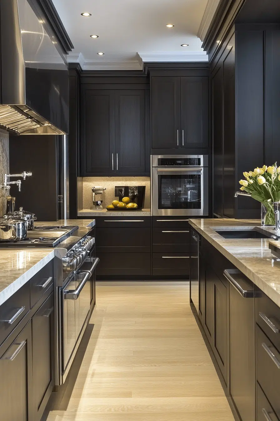
18. Charcoal Modern Edge
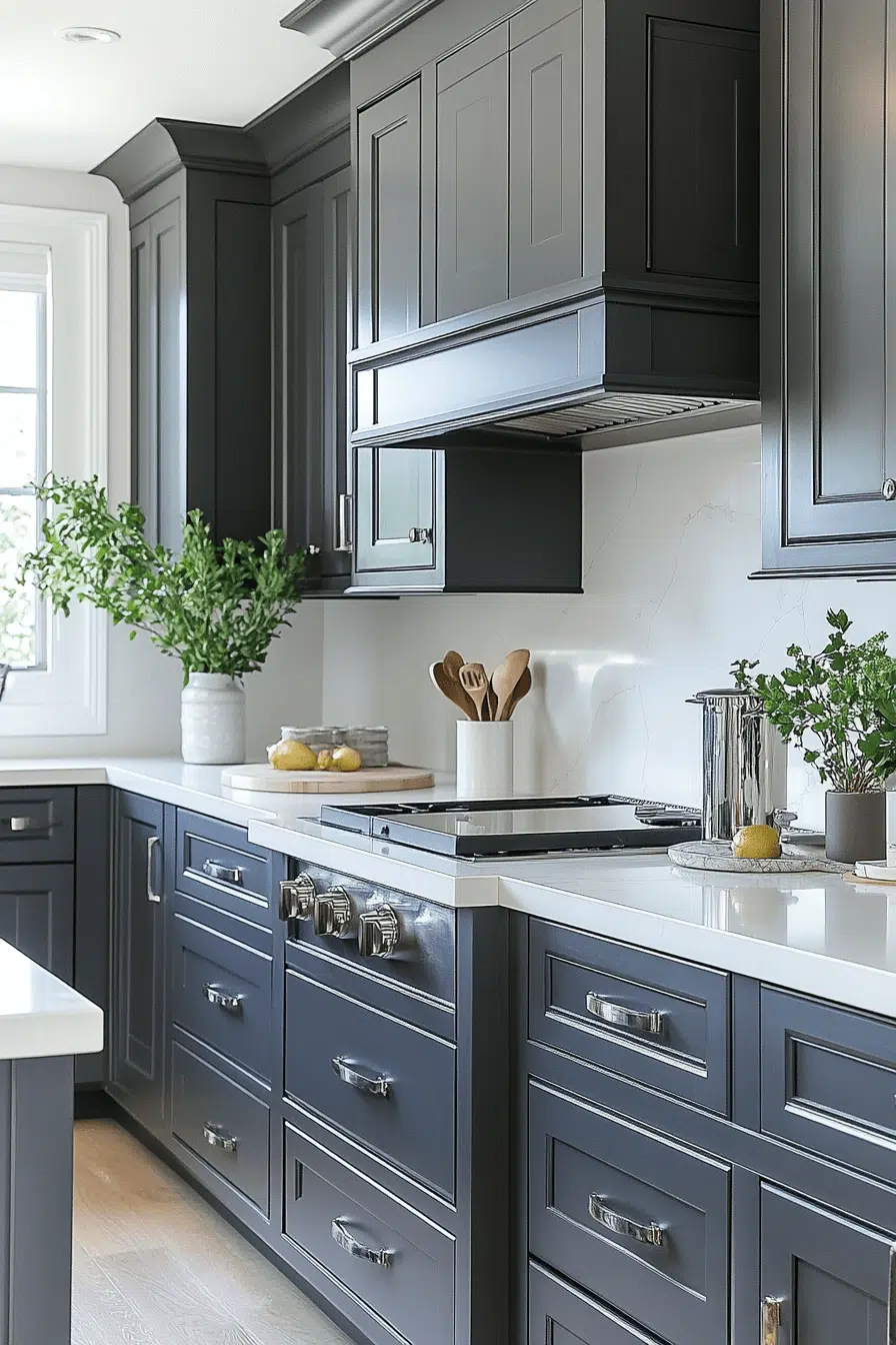
Modern depth defines this charcoal-inspired take on kitchen cabinet color ideas. This deep neutral adds boldness without harsh contrast. Charcoal pairs beautifully with stone, metals, and rich woods. The look feels sleek and grounded. It’s also practical for busy kitchens.
✎ Steal This Look
- Paint Color: Clare Paint Charcoal CC-160
- Furniture: Stainless steel kitchen island with waterfall edge countertop, walnut or oak base cabinetry, matte black hardware pulls
- Lighting: Linear pendant lights with brushed brass or matte black fixtures over island
- Materials: Honed stone countertops (granite or quartz in gray/charcoal), stainless steel appliances, matte finish cabinet doors, concrete or light wood flooring
Charcoal is the sophisticated workhorse of modern kitchens—it whispers luxury rather than shouting it. It’s bold enough to feel intentional and current, yet neutral enough to ground eclectic kitchen styles and stay timeless.
19. Turquoise Playful Pop
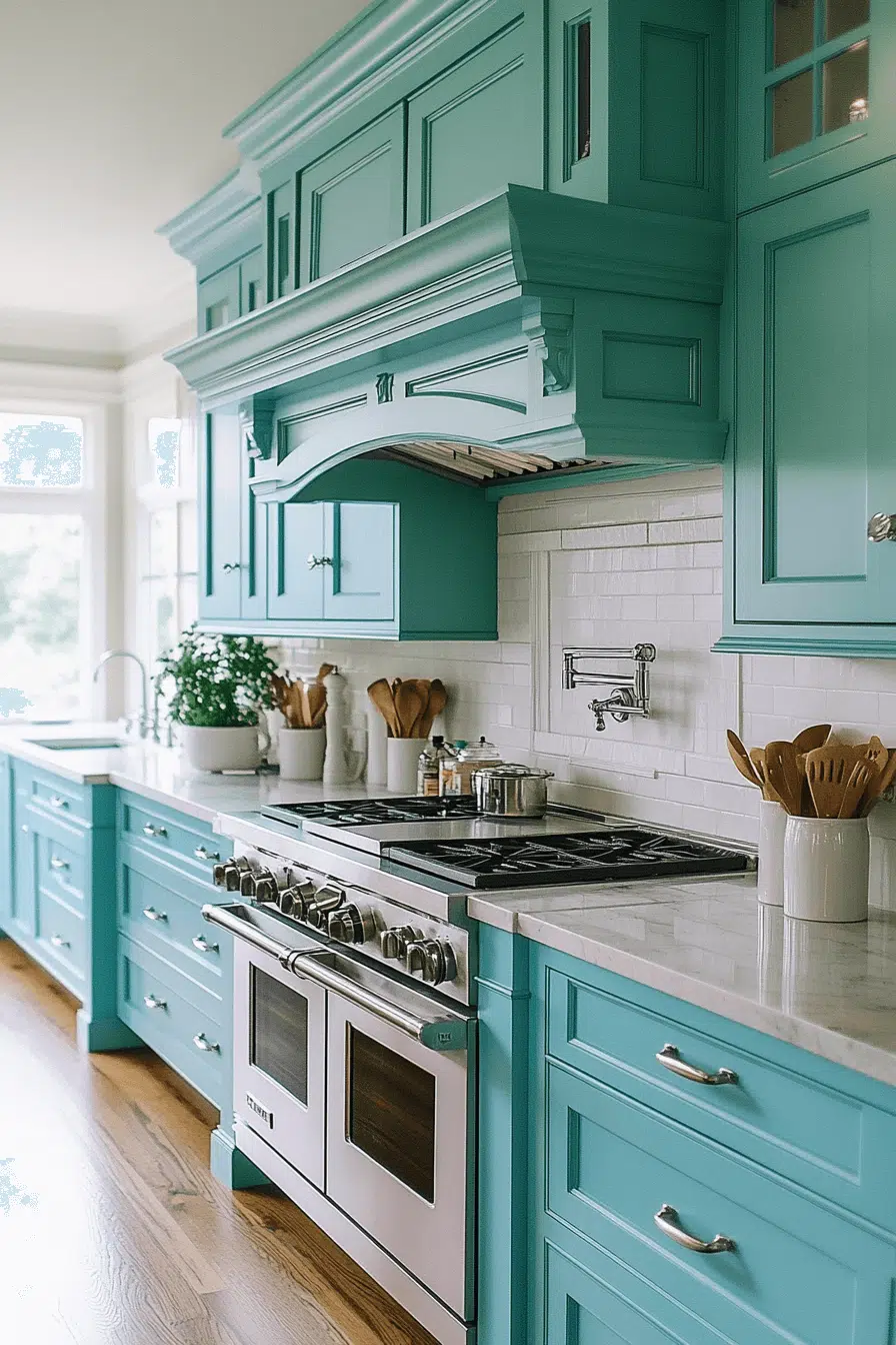
Playful creativity takes over when turquoise leads your kitchen cabinet color ideas. This vibrant blue-green brings personality and fun. Turquoise pairs beautifully with white, copper, and wood finishes. The look feels energetic and eye-catching. It’s perfect for bold, expressive spaces.
🏠 Steal This Look
- Paint Color: Fine Paints of Europe Turquoise 502
- Furniture: White kitchen island with open shelving, warm wood bar stools with turquoise upholstered seats, natural wood dining table
- Lighting: Copper pendant lights with warm brass accents hung above island countertop
- Materials: Copper hardware on cabinet doors, white subway tile or shiplap backsplash, warm wood countertop edges, matte finish on turquoise cabinetry
Turquoise kitchen cabinets signal confidence and creativity. This is for homeowners ready to make a statement without apology, blending bohemian spirit with modern clarity.
20. Honey Golden Glow
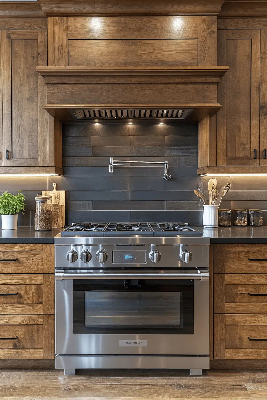
Golden warmth fills the room when honey tones inspire your kitchen cabinet color ideas. This glowing shade creates cozy, nostalgic charm. Honey cabinetry looks stunning with butcher block and dark hardware. The result feels welcoming and timeless. It’s perfect for lived-in, inviting kitchens.
🖼 Steal This Look
- Paint Color: Backdrop Honey Glow HD-139
- Furniture: Butcher block countertops, open shelving with warm wood tones, honey-stained wooden dining table
- Lighting: Warm brass or bronze pendant lights with frosted glass shades
- Materials: Matte brass cabinet hardware, butcher block wood, warm-toned subway tile backsplash
Honey cabinets whisper comfort. This color works because it feels earned, like a kitchen that’s hosted countless dinners and holds real memories. It’s warmth you can actually feel.
21. Teal Retro Charm
Retro elegance shines when teal becomes part of your kitchen cabinet color ideas. This rich shade adds character and curated charm. Teal pairs beautifully with cream, gold, and patterned tile. The space feels collected and stylish. It’s ideal for unique, personality-filled kitchens.
🎨 Steal This Look
- Paint Color: Sherwin-Williams Oceanside SW 6169
- Furniture: Cream-colored kitchen island with turned legs, open shelving with gold metal brackets, vintage-style bar stools with woven seats
- Lighting: Brass or gold pendant lights with retro-inspired globe or dome shades hanging above island
- Materials: Patterned encaustic tile backsplash, brushed gold hardware, warm wood open shelving, cream cabinetry on lower units, glossy teal upper cabinets
Teal retro kitchens celebrate individuality and timeless style rather than trending neutrals. This look works beautifully in homes where you want your kitchen to feel like a collected, lived-in space with stories to tell.
22. Platinum Sleek Shine
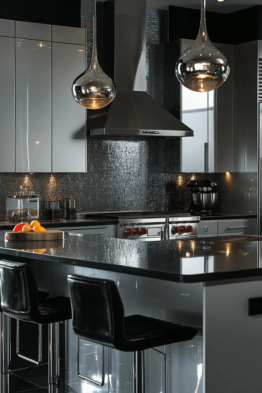
Sleek shine defines this platinum-inspired take on kitchen cabinet color ideas. Reflective silver tones enhance light and modern appeal. Platinum cabinetry pairs beautifully with glass, white, and black finishes. The result feels futuristic and upscale. It’s a bold yet refined choice.
🌟 Steal This Look
- Paint Color: Benjamin Moore Platinum Gray HC-170
- Furniture: Stainless steel bar stools with black upholstered seats, white marble-top kitchen island, minimalist metal-frame dining chairs
- Lighting: Modern chrome or brushed nickel pendant lights with frosted glass shades over island; recessed LED lighting for under-cabinet accent
- Materials: Reflective glossy cabinet finishes, polished chrome hardware, white quartz or marble countertops, glass tile or subway tile backsplash, stainless steel appliances
Platinum cabinets deliver that high-end, contemporary kitchen everyone wants—they feel expensive without screaming ‘trendy.’ This is the color choice for someone who loves modern luxury and isn’t afraid of a bold, unified vision.
23. Tuscan Rustic Warmth
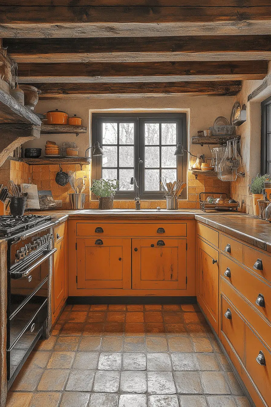
Rustic warmth comes alive with Tuscan-inspired kitchen cabinet color ideas. This vibrant orange tone adds festive Mediterranean energy. It pairs beautifully with dark wood, brass, and tile. The space feels lively and welcoming. It’s perfect for social, heart-of-the-home kitchens.
🎨 Steal This Look
- Paint Color: Farrow & Ball Red Earth 64
- Furniture: Open shelving with dark wood frames, kitchen island with carved wood details, wrought iron bar stools with warm leather seats
- Lighting: Brass or bronze pendant lights with amber glass shades, iron chandeliers with candle-style bulbs
- Materials: Terracotta tile backsplash, dark wood cabinetry, brass hardware, natural stone countertops, glazed ceramic accents
Tuscan kitchens celebrate warmth and gathering. This vibrant orange cabinet palette transforms your kitchen into a living, breathing heart-of-the-home that invites conversation and lingering.
24. Sage Natural Calm
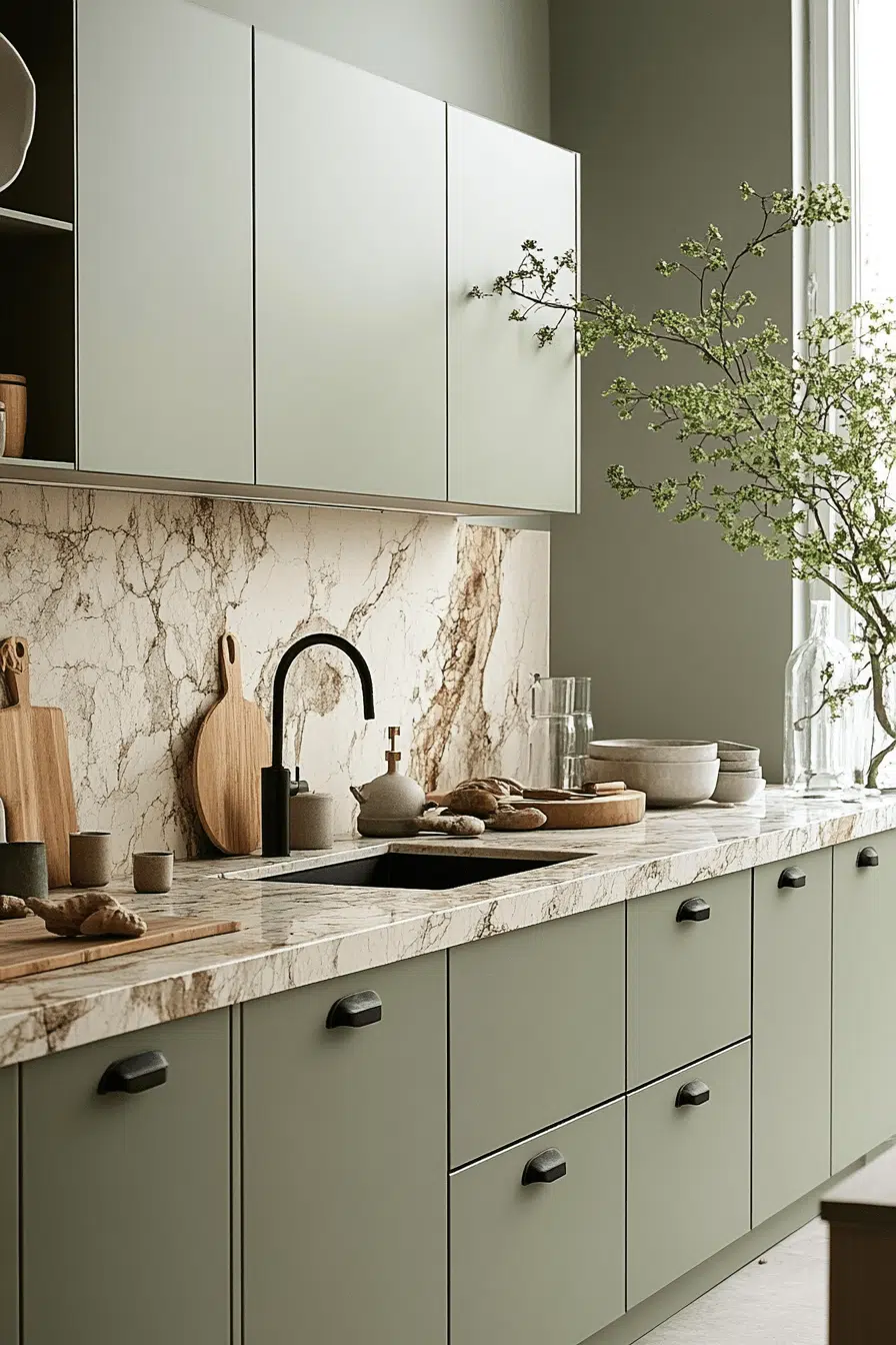
Soft serenity defines sage-inspired kitchen cabinet color ideas. This muted green brings calm and organic beauty. Sage pairs beautifully with quartz, wood, and brass. The look feels balanced and timeless. It’s perfect for relaxed, nature-inspired kitchens.
✎ Steal This Look
- Paint Color: Behr Sage Green N450-3
- Furniture: Natural wood kitchen island with open shelving, brass-accented bar stools
- Lighting: Brass or bronze pendant lights with frosted glass shades over island
- Materials: White or cream quartz countertops, natural wood cabinetry, brass hardware, light wood flooring
Sage is the quiet achiever of kitchen cabinet colors. It whispers elegance rather than shouts it, making your kitchen feel like a peaceful retreat where you actually want to spend time cooking.
25. Indigo Moody Luxe
Moody elegance emerges when indigo anchors your kitchen cabinet color ideas. This deep hue adds richness with a modern twist. Indigo pairs beautifully with marble and warm metallics. The result feels bold and luxurious. It’s perfect for dramatic, high-style kitchens.
✎ Steal This Look
- Paint Color: Valspar Indigo Shadow 1617-07
- Furniture: Kitchen island with marble countertop, open shelving with brass or gold hardware accents, bar seating with upholstered navy or charcoal stools
- Lighting: Brass or brushed gold pendant lights with opal or frosted glass shades suspended over island
- Materials: Polished marble backsplash and countertops, brushed brass cabinet hardware, lacquered indigo cabinet doors, warm metallic fixtures, dark grout lines
Indigo moody luxe is for homeowners ready to make a statement. This isn’t safe beige—it’s a confident choice that transforms kitchens into design destinations while maintaining timeless sophistication.
26. Saffron Golden Spice
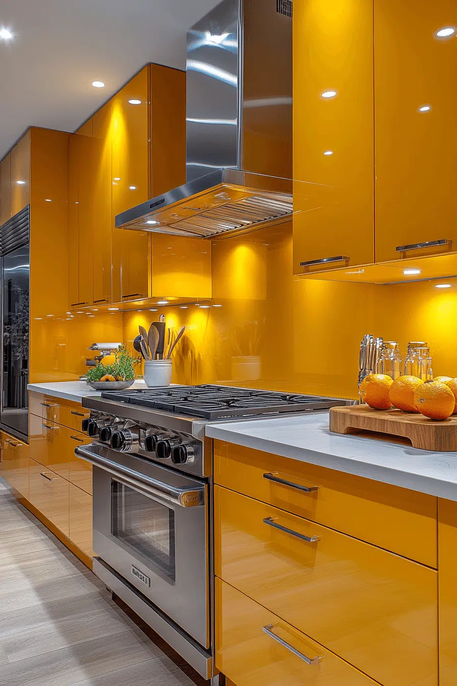
Spiced warmth fills the space when saffron shapes your kitchen cabinet color ideas. This golden tone adds exotic flair and vibrancy. Saffron cabinetry glows against white walls and dark counters. The energy feels joyful and expressive. It’s a color full of personality.
✎ Steal This Look
- Paint Color: PPG Autumn Blaze 6335. A warm, golden-toned white that allows saffron cabinetry to remain the hero without competing for attention
- Furniture: Light wood open shelving or glass-front cabinets to balance the warmth of saffron; stainless steel kitchen island or cart for contrast
- Lighting: Warm brass or gold pendant lights suspended over kitchen island to echo saffron warmth without oversaturation
- Materials: Matte dark granite or charcoal quartz countertop, white subway tile or Carrara marble backsplash, brushed brass hardware
Saffron cabinets signal confidence and personality. This is for homeowners ready to make a bold, joyful statement—not a safe neutral play, but a warm hug of color that energizes morning coffee and dinner prep alike.
27. Frosty White Fresh
Clean clarity defines this frosty white approach to kitchen cabinet color ideas. This crisp shade enhances brightness and modern appeal. Frosty white works beautifully in minimalist and Scandinavian kitchens. It provides a fresh canvas for any accent style. The look feels timeless and adaptable.
A happy kitchen often starts with colors that feel welcoming and uplifting. With these 27 kitchen cabinet color ideas you can create a space that feels cheerful comfortable and easy to enjoy every day. Thoughtful color choices help set the mood without overwhelming the room. These ideas show how simple updates can bring positive energy into your kitchen. Save your favorites and start creating a kitchen mood that makes everyday moments feel happier.
★ Steal This Look
- Paint Color: Dunn-Edwards Swiss Coffee DE 6255
- Furniture: Minimalist kitchen island with clean lines, light wood or white base with simple hardware
- Lighting: Pendant lights with frosted glass or matte white finishes; linear under-cabinet LED strips for brightness
- Materials: Matte white or satin cabinet finishes, light wood countertops (oak or ash), white subway tile or polished concrete backsplash
Frosty white is the kitchen equivalent of a blank page—it’s forgiving, timeless, and makes every accent pop. This approach lets your lifestyle drive the style without your cabinetry dating itself in five years.